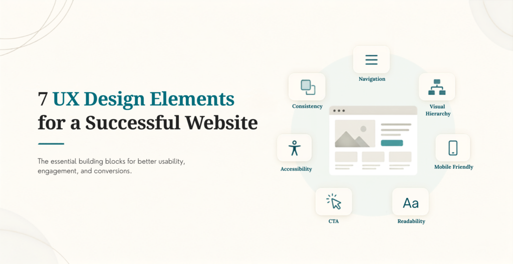
Good UX design comes down to a short list of elements that consistently separate a site people stick with from one they abandon. None of these are new ideas, but how each one gets built has changed, especially now that AI touches personalization, content generation, and interface design directly. Here are the 7 elements worth getting right, and where AI now fits into each.
7 UX elements worth getting right
Table Of Contents
Table Of Contents
A Simplified User Journey
Every visitor arrives with a specific intention and wants to complete it with as little friction as possible. A simplified journey respects that by removing every step that doesn’t move a visitor toward their goal. Some approaches age better than others: predictive design that shows users what they probably need next, step-by-step flows that serve one obvious choice at a time, and gradual disclosure that avoids overwhelming users with all the detail up front.
A useful gut check here is what we call the Two-Second Scan Test: can a first-time visitor tell what a page is for and what to do next within two seconds of landing on it? If the answer requires reading a paragraph first, the journey isn’t simplified yet, no matter how clean the visual design looks.
Context-based information display is worth calling out specifically: showing a returning visitor their order history instead of a generic welcome message, or adjusting navigation based on the device someone’s using, both reduce the number of steps between arrival and action. Every one of these techniques is really solving the same problem: a visitor with a specific goal shouldn’t have to work to find the path toward it.
Personalization Built on Real Behavior
Generic experiences convert worse than personalized ones, and the gap has only gotten more measurable. McKinsey’s research on personalization puts the revenue lift at 10 to 15% for companies that do it well, driven by showing the right content to the right visitor instead of the same homepage to everyone.
AI has now made this more accessible for teams without a dedicated data science role. Modern personalization tools can now adjust content, layout, and offers in real time based on browsing behavior, without custom development for every rule. The starting point is still the same: personalize based on what a visitor does, not assumptions about who they might be. Our guide to improving UI/UX for conversion covers where personalization tends to pay off fastest.
Content Structured for Scanning, Not Reading
Most visitors scan a page before they read any of it, which means visual hierarchy carries more weight than the words themselves. Clear headings, deliberate white space, and a visual order that guides the eye toward what matters most all do real work here. The goal isn’t cramming in every possible detail. It’s cutting anything that doesn’t help a scanning visitor find what they came for, then trusting white space to do some of that filtering for you.
This matters for AI tools now too. Answer engines like ChatGPT and Perplexity extract information from clearly structured pages far more reliably than from dense, unstructured paragraphs, so scannable content now serves human visitors and AI crawlers at the same time.
Video Content Used With Intent
Video still outperforms static images for demonstrating a product or building trust quickly, but the format has shifted toward short, vertical, mobile-first clips rather than long-form productions. A brief, well-shot video showing a product in real use tends to outperform a polished studio piece, since it reads as authentic rather than staged. Our roundup of current UI/UX design trendscovers how short-form video fits into a broader design strategy.
A Humanized, Not Just Functional, Experience
Users respond to products that feel considerate rather than purely mechanical. Small, well-placed micro-interactions, a confirmation animation, a friendly empty-state message, a loading indicator with personality, build a sense that the interface is responding to a person, not just processing a request.
AI conversational tools have added a new layer here. A well-built AI chat assistant that answers a real question in a natural, direct tone can make an interface feel more human than a static FAQ page ever could. The risk is a chatbot that sounds scripted or gets stuck in a loop, which does more damage to trust than not having one at all. The bar for humanized AI is the same as any other UX element: it needs to solve a real problem, not just exist.
Tone matters as much as function here. An error message that says “something broke, try again” reads very differently from a generic “error 500” code, even though both convey the same failure. The first treats the visitor like a person who deserves an explanation. The second treats them like a debugging log.
Voice and AI-Assisted Interfaces
Voice search adoption kept climbing through smart speakers and in-car assistants, but the bigger shift by 2026 is conversational AI interfaces more broadly, not just voice specifically. Visitors increasingly expect to ask a question in plain language, by voice or by typing into a chat box, and get a direct answer rather than hunting through a navigation menu. Designing for this means writing content and structuring FAQs in a natural, conversational format, since that’s the format both voice assistants and AI chat tools work best with.
Passkeys Instead of Passwords
Biometric login stopped being a novelty and became the recommended default. Apple, Google, and Microsoft have jointly pushed passkeys, login credentials tied to a device’s fingerprint, face recognition, or PIN, as a replacement for passwords entirely, not just an alternative to them. For UX purposes, that means fewer abandoned signups from forgotten passwords and a faster returning-user experience. Any site still requiring a traditional password as the only login option is asking users to do more work than they now expect to do.
The UX benefit compounds over time. A visitor who signs up with a passkey doesn’t need a password reset flow, doesn’t get locked out after too many failed attempts, and doesn’t abandon a purchase because they forgot which password they used on this particular site. Each of those is a small friction point on its own, but together they add up to a meaningfully smoother return-visit experience.
Bringing These Elements Together
These 7 elements work best in combination rather than as a checklist to tackle one at a time. A simplified journey with strong content but no personalization still underperforms a site that gets all three working together. If you want to see these elements applied well in practice, our roundup of UX website examples built for conversion shows real sites doing this successfully.
Want a second opinion on which of these elements your site is missing? Contact KrishaWeb and we’ll walk through what would move the needle fastest for your specific site.
Frequently Asked Questions
Which UX element has the biggest impact on conversion?
Personalization tends to show the clearest revenue impact when it’s done well, but a simplified user journey is usually the higher-priority fix first. Personalizing a confusing, cluttered experience just means showing the wrong layout to the right person faster.
Do small business websites need all 7 of these elements?
Not all at once. A simplified journey, scannable content, and passkey support (if the site involves any login) are worth prioritizing on any site. Personalization, video, and conversational AI interfaces matter more once a site has enough traffic and content to justify the added complexity.
Is voice search still worth designing for?
Yes, though the framing has broadened. Rather than optimizing narrowly for smart speaker voice search, the more useful approach is writing content in a natural, question-and-answer format that serves voice search, AI chat assistants, and traditional search all at once.
How do I know if my site’s UX is too generic?
If every visitor sees the identical homepage regardless of how they arrived or what they’ve browsed before, that’s a strong signal. Even basic personalization, like showing recently viewed items or adjusting a call-to-action based on traffic source, moves a site out of purely generic territory.
Should every website replace passwords with passkeys?
Where the platform and user base support it, yes, it’s worth offering as the primary option. Not every visitor’s device or browser supports passkeys yet, so a password fallback is still worth keeping for now, but passkeys should be the default path being pushed to new sign-ups.
Bringing These Elements Together
These 7 elements work best in combination rather than as a checklist to tackle one at a time. A simplified journey with strong content but no personalization still underperforms a site that gets all three working together. If you want to see these elements applied well in practice, our roundup of UX website examples built for conversion shows real sites doing this successfully.
See Your Store's New Look, Generated by AI
Give us your store requirements and get an AI-designed landing page in a few minutes.




 KrishaLabs
 KrishaStudio
 KrishaStore