The best personal websites in 2026 do one thing well: they make you memorable in under ten seconds. Below are 15 real examples, ranked from the most widely recognized names to the more niche ones, so you can see what actually works whether you’re an entrepreneur, a developer, or a freelancer building your first site. Each entry includes one specific detail worth copying, not just a screenshot to admire.
If you’re short on time, skim the takeaway line under each name, then jump to the AI section near the end. That’s where personal websites are changing the fastest right now.
Why Create a Personal Website in 2026?
Your resume or LinkedIn bio can only say so much. A personal website is the one place online where you control the full story: your work, your voice, and the order in which people see it.
Very few professionals actually have one, which is exactly why it stands out. A CareerBuilder survey found that 70% of employers research candidates online before hiring, and having your own site means you decide what they find first instead of leaving that to whatever search results turn up.
Here’s what a good personal website does for you:
Builds credibility fast. Your experience, portfolio, and background sit in one place instead of scattered across five different profiles.
Make a first impression before you get in the room. A strong personal site can be the deciding factor between you and another candidate or freelancer with a similar resume.
Gives you full creative control. Unlike a LinkedIn profile or a marketplace listing, nothing about the layout, tone, or story is templated for you.
Teaches you real, transferable skills. Building and maintaining your own site means picking up basic SEO and web fundamentals along the way, skills that pay off well beyond the site itself.
One practical note before the list: whatever platform you use, keep the site current. A personal website with a 2023 portfolio and a 2026 bio undercuts the credibility it’s supposed to build.
15 Best Personal Website Examples You Should Know About
1. Gary Vaynerchuk Entrepreneur, Author & CEO of VaynerX
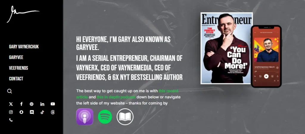
Gary Vaynerchuk’ssite earns its traffic by being ruthlessly simple. The homepage leads with a short video, one clear headline about who he is, and three buttons: read his books, watch his content, or work with his agency. There’s no long scroll to get through first.
What stands out is how the site routes different visitors to different outcomes on the very first screen. A job seeker, a brand looking to hire VaynerMedia, and a fan looking for a podcast episode all land on their own path within two clicks.
Takeaway: if your personal brand serves more than one audience, sort your visitors before you try to sell to them.
2. James Clear Author of Atomic Habits
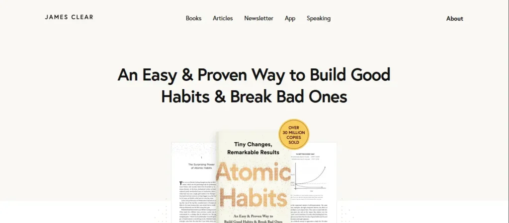
James Clearbuilt his brand on one book, and his website mirrors that same discipline. The design is plain white with a single serif font and almost no imagery. It reads like a well-edited essay rather than a marketing page, which fits an author whose entire message is about removing friction.
The site’s real strength is its free resource library. Habit guides, book summaries, and a newsletter sign-up sit above the fold, offered before he asks for anything. By the time a visitor reaches his book page, they’ve already gotten value three times over.
Takeaway: consultants, coaches, and authors can build more trust with a page of free, useful content than with a page that sells.
3. Ali Abdaal Doctor, Creator & Entrepreneur
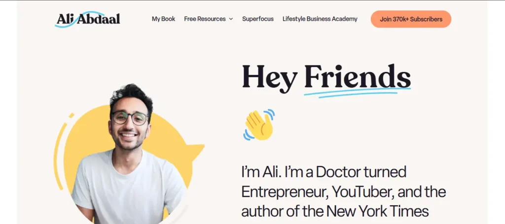
Ali Abdaalis a doctor turned content creator who built a large following around productivity, study skills, and personal development. His site borrows its structure from Notion: clean, minimal, and unafraid of the odd emoji.
The content itself is what carries the page. Alongside a blog, he publishes notes for every podcast episode and shares his book notes directly on the site, which gives visitors dozens of ways to land on a page that matches what they’re searching for.
Takeaway: publishing companion content for everything you make (podcast notes, book notes, summaries) multiplies the ways people find your site.
4. Seth Godin Author, Marketer & Blogger
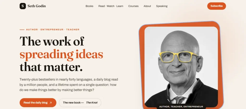
Seth Godin has published a blog post nearly every day for close to two decades, and seths.blogstill looks the way it did years ago: no header image, barely a navigation menu, just text. That restraint is the entire point. His audience comes for the thinking, not the design, so the site gets out of the way.
It’s proof that a personal website doesn’t need a big budget or a flashy build to work. Consistency and a clear point of view carry the site further than any layout choice could.
Takeaway: if your value is your thinking rather than your visuals, resist the urge to over-design.
5. Bruno Simon Creative Developer
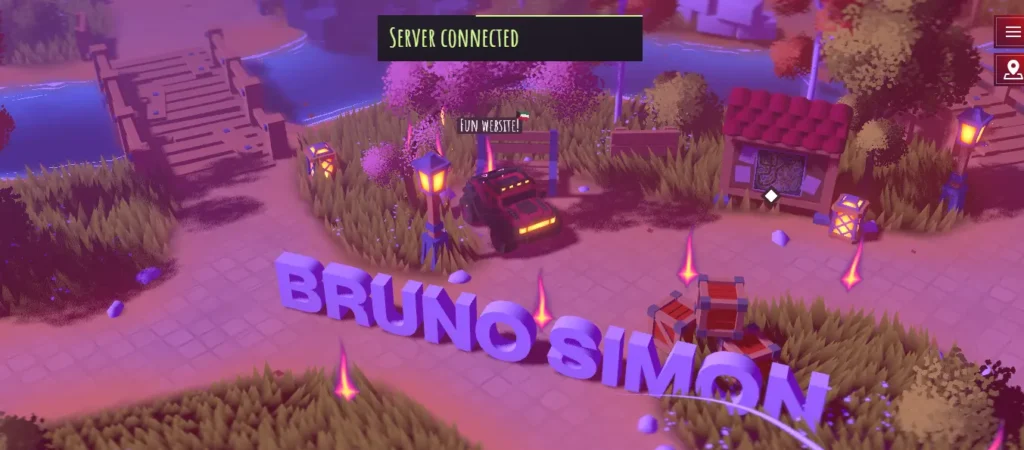
Bruno Simon’s portfolio is a fully playable 3D world. Visitors drive a small car around a virtual island to find his projects, each one parked like a building you can enter. Built with Three.js and WebGL, it’s one of the most referenced sites in the creative development community.
This isn’t a template most people should copy directly, but it makes a point worth borrowing: a portfolio for a technical role can double as proof of the skill itself.
Takeaway: if you build interactive experiences for a living, your own site is the best place to demonstrate it, not just describe it.
6. JR Taylor Celebrity Choreographer
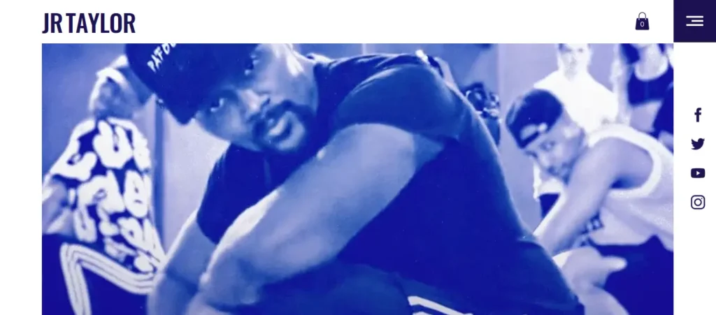
JR Tayloris a Los Angeles-based choreographer and creative director who has worked with artists like Beyoncé and Jennifer Lopez, and his site is built to feel like his career: dynamic and a little loud in the best way.
His homepage is full of bright videos of his routines. Interspersed throughout the site are call-to-action buttons inviting visitors to learn about his background, watch more performances, or contact him directly. A small section of merchandise peddles branded gear associated with his signature catchphrase.
Takeaway: If you’re in a performance-based career, video-first homepages can be a great way to go, as long as you still have a clear next step for visitors who want to hire you.
7. Gary Sheng, a Software Engineer
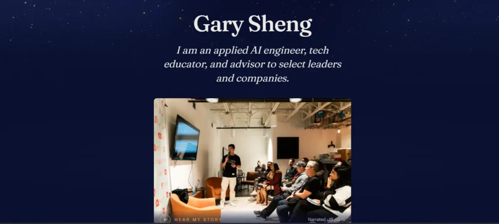
Gary Sheng’s site, with its clickable links, employer logos, and sections on his work philosophy and the communities he belongs to, makes the standard resume more personal.
A simple top navigation lets visitors jump straight to a section, or they can scroll through the whole story from his education at Duke through his current roles. The photo and layout choices keep it feeling confident without feeling overproduced.
The bottom line? A resume style site is best when it gives context that a PDF resume can’t like the communities you’re part of or the philosophy behind your work.
8. Libby Peterson Journalist at The New York Times
Libby Petersonwrites on art, culture, photography, and style for The New York Times, and her site is built to prove that with minimal fuss. It opens with a full-screen image of her workspace, a personal touch that sets the tone before a single word of copy.
The site is organized into clear sections: front-page headlines she’s written, long-form reported stories, magazine features, and the covers she’s contributed to. High-quality images throughout keep it visually engaging without slowing the page down.
Takeaway: organizing your portfolio by type of work, not just by date, makes it far easier for an editor or client to find what they’re looking for.
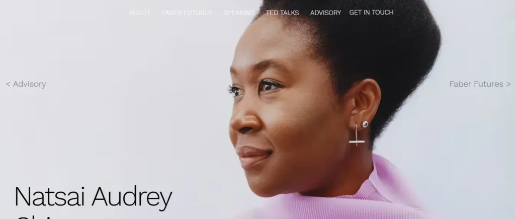
9. Natsai Audrey Chieza
Designer, Maker & Speaker Natsai Audrey Chieza is a designer with a biology background, and her website is an example of that very niche. Visitors can immediately relate to the person behind the name as the site starts with a full-screen image of Natsai and her name and key skills.
The homepage also surfaces notable moments from her career, including her TED talk, and gives space to Faber Futures, the design studio she founded.
Takeaway: if your work sits at the intersection of two fields, say so plainly in the first screen instead of making visitors piece it together.
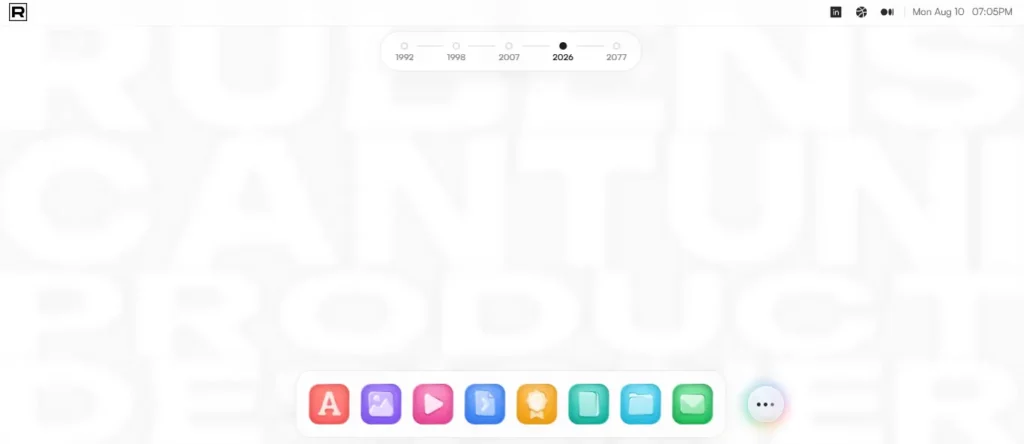
10. Ruben Cantuni Digital Product Designer
Ruben Cantuni’ssite opens with a playful GIF of the word “CIAO” being edited in real time, the kind of small touch that signals design skill before a single project loads.
From there, he gives a short summary of his strengths, followed by a collapsible list of past roles visitors can click into for more detail. He closes with a direct invitation to get in touch, and he’s upfront that some of his best work can only be discussed privately, which quietly encourages recruiters to ask.
Takeaway: a small, well-made interaction on your homepage can do more to prove your skill than a long case study.
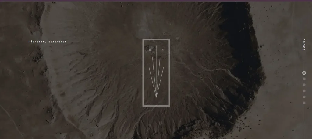
11. Brandon Johnson Planetary Scientist & Researcher
Brandon Johnson is a researcher, planetary scientist, and educator, and his site leans into that identity with imagery connected to space and astronomy throughout.
The layout is easy to navigate, and a distinctive typeface for his name (styled as “Brand-On Johns-On”) adds personality without getting in the way of the content. Animated elements help to make what might be a static resume more of an experience. A textured, layered background gives the page a sense of depth appropriate to the subject.
Takeaway: visual themes tied to your field of work help a technical bio feel less like a document and more like a story.
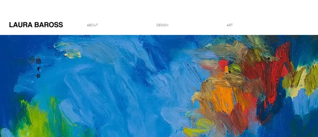
12. Laura Baross – Designer & Architect
Laura Barossis a European designer working in architecture and interior design, with a strong focus on sustainable living and her website reflects that focus in every choice. The clean, neutral palette with generous white space is designed to be minimal and easy to explore.
The site is split into interior design projects, a photography portfolio and a journal where she writes about living a zero-waste life. An About page outlines her design philosophy, and a Press page aggregates her media appearances, lending the entire site a unified feel.
Takeaway: It’s usually a cohesive color palette across each section that makes a personal brand feel intentional, not accidental.
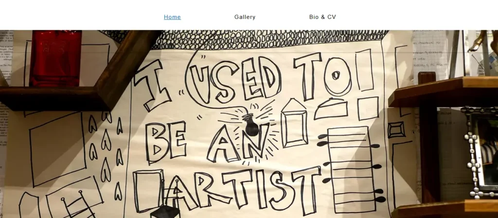
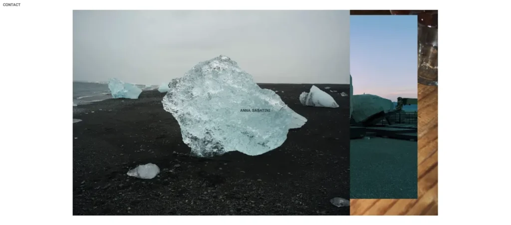
13. Anna Sabatini – Web Designer & QA Analyst
Anna Sabatinicombines digital design and a sketchbook esthetic, with a pencil-lined self-portrait, hand-drawn lettering and doodle-style graphics throughout the site. A typewriter style font highlights the mix of traditional and digital design.
Her personal blog is a journal section where she posts her observations and ideas, and is written in a more casual, first-person voice than the rest of the site. It gives visitors a reason to return other than just to view her portfolio once.
Takeaway: A regular journal/blog feature gives people a reason to return to your site, rather than dropping by once and then leaving.
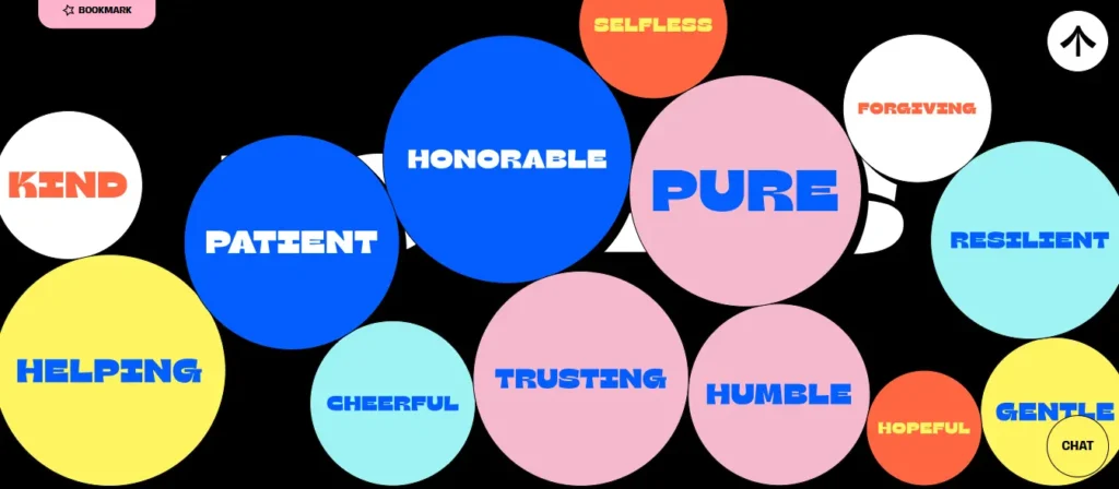
14. Mack and Pouya Wedding Photographers
Most photography portfolios are built purely as image galleries. Mack and Pouya, a US-based wedding photography studio, took a different approach and put just as much thought into the brand and UX as the photos themselves.
The site leans into a colorful, 1960s-inspired design that mirrors their playful shooting style, right down to a contact form that lets couples select exactly which services they want, paired with a vibrant gallery and consistent logo treatment throughout.
Takeaway: a portfolio site doesn’t have to look neutral to look professional. Let the design match the actual style of your work.
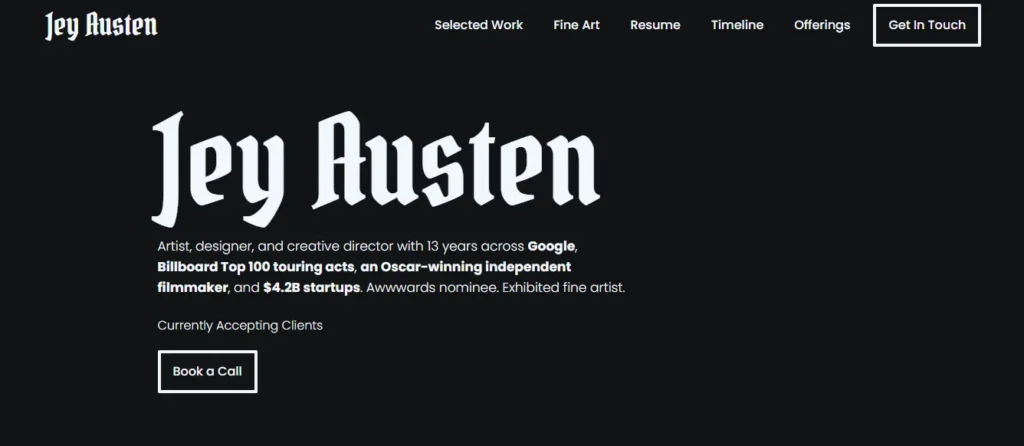
15. Jey Austen Designer & Illustrator
Jey Austen’s art is visually simple: a black background, a bold typeface and white line-art graphics that contrast sharply with the dark canvas. It’s a simple palette, but it still manages to be distinctive.
The portfolio features a variety of work including brand designs, GIFs, illustrations and UI/UX projects, all with a brief description. That range, and the consistent color treatment, goes a long way to showing versatility without the site feeling scattered.
Takeaway: The simplest way to make a diverse portfolio look like one body of work is to use a strict two-color palette.
How AI Is Changing Personal Websites in 2026
Two shifts are changing how personal websites get found and built right now.
First, AI answer engines read personal websites directly. When someone asks ChatGPT or Perplexity to recommend a photographer, a consultant, or a freelance developer, those tools pull straight from bios, service lists, and FAQ sections instead of sending the person to a search results page. A personal site with a clear one-paragraph bio, a plainly stated list of services, and a short FAQ block gets picked up far more often than one buried inside a long, story-driven About page.
We cover this shift in more depth in our piece on how AI is changing web design and development, but the short version for a personal site is this: write your bio the way you’d answer the question out loud, not the way you’d write a magazine profile.
Second, AI tools have lowered the cost of a first draft. Site builders can now generate a working layout, a bio, and placeholder copy in minutes. That’s useful for getting unstuck, but it also means a generic AI-written personal site is easy to spot, and easy to skip. Every site in this list stands out because a real person’s voice, specific project details, and small design choices carry the page. Use AI to speed up the scaffolding. Don’t let it write the parts that are supposed to sound like you.
A growing number of personal sites are also adding a small AI chat widget that answers visitor questions using the site’s own content as its source. It’s a useful touch for consultants and speakers who field the same three questions on every call, though it only works as well as the bio and project pages behind it, since the widget can’t answer accurately from outdated content.
What to Steal From These Examples
You don’t need Gary Vaynerchuk’s audience or Bruno Simon’s WebGL skills to apply what makes these sites work. A few patterns repeat across all 15:
Every one of them answers “who is this and what do they do” within the first five seconds, before a visitor has to scroll.
None of them uses more than two typefaces on the homepage.
The design matches the person. A wedding photographer’s site looks nothing like a planetary scientist’s, and it shouldn’t.
Almost every site gives visitors a next step, whether that’s booking a call, reading more, or viewing a full case study, instead of leaving them with just a bio to read.
If you’re comparing broader design direction beyond personal sites, our roundup of modern website design examples and our breakdown of current website UX best practicesare worth a look. And if you’re sizing your own project against a bigger brand site, our corporate website examples roundup shows how that same first-five-seconds rule scales up for companies.
Building Your Own Personal Website
If you’ve read this far, you’re serious about building a site of your own, whether that means a redesign of an old one or starting from scratch. Personal websites remain one of the best tools for building an online identity, showcasing your work, and connecting with the clients and collaborators worth having.
Building one from the ground up is harder than it looks, especially once you get past the template and start making real decisions about layout, copy, and structure.
That’s exactly the kind of project our web design services team takes on: a site that looks like you, loads fast, and is easy to update the day something in your career changes. If you’re ready for a second opinion on your draft or a full build, get in touch and we’re happy to take a look.
Frequently Asked Questions
What makes a personal website great in 2026?
The best personal websites in 2026 answer who you are and what you do within the first five seconds, before a visitor has to scroll. Clean typography, one or two fonts at most, a working portfolio, and a clear next step (book a call, read more, download a resume) matter more than flashy animation. The strongest sites pair a real personal voice with just enough structure to feel professional.
How much does it cost to build a personal website?
A simple one-page personal site on a website builder can run from free up to a few hundred dollars a year for hosting and a domain. A custom-designed personal website with a portfolio, blog, and booking system typically runs $1,500 to $8,000 depending on complexity, and it’s worth the investment once the site is doing real business development for you.
Do I need a developer, or can I use a website builder?
Most personal websites, especially early-career ones, do fine on a website builder. You need a developer once your site requires custom interactions, tight page speed for SEO, or integration with booking, payment, or CRM tools. Many professionals start on a builder and move to a custom build once the site starts generating real leads.
How is AI changing personal websites?
AI answer engines like ChatGPT and Perplexity now read personal websites directly and surface bios, services, and FAQs in their answers, so structuring your content for clear extraction matters more than it used to. AI tools also speed up building a first draft, though a generic AI-written bio is easy for visitors to spot, so the actual writing still needs a specific, real voice behind it.
Who needs a personal website most right now?
Freelancers, consultants, job seekers in competitive fields, and anyone building a personal brand alongside a day job benefit most. A CareerBuilder survey found that 70% of employers research candidates online before hiring, so a personal website gives you control over what they find instead of leaving it to whatever search results turn up.
How long does it take to build a personal website?
A basic personal website on a builder can go live in a day or two. A custom-designed site with a portfolio, blog, and proper SEO setup usually takes two to four weeks from first draft to launch, depending on how much content and how many rounds of revision are involved.
Disclaimers: This list has been curated through extensive research and publicly available online resources to showcase inspiring personal websites. All website examples mentioned are for educational and illustrative purposes only.
We do not claim ownership of any visual or written content featured and no copyright infringement is intended. This compilation is not an endorsement or affiliation with the individuals or businesses featured.
If your website is listed and you’d prefer it not to be, or if you’d like to be considered for future lists, kindly contact us — we’d be happy to connect.
Nisarg Pandya
Project Manager
Experienced Project Manager and Scrum Master at KrishaWeb, delivers expertise in Scrum methodologies, Laravel, React.js, UX design, and project management, ensuring efficient project delivery and agile implementation.




 KrishaLabs
 KrishaStudio
 KrishaStore